Appearance & Theming
Appearance is how Brisal looks, and you set it along three independent axes:
- Mode — light, dark, or follow the operating system.
- Font size — one number that scales the whole UI.
- Palette — the color identity (the orange flame default, or one you author).
All three live together on one screen — Settings → Appearance — and all three are per-workspace: each workspace carries its own appearance, resolved over a single system-wide default. So a work workspace can be calm dark orange while a side project is light and something else entirely, and switching workspaces re-themes the app.
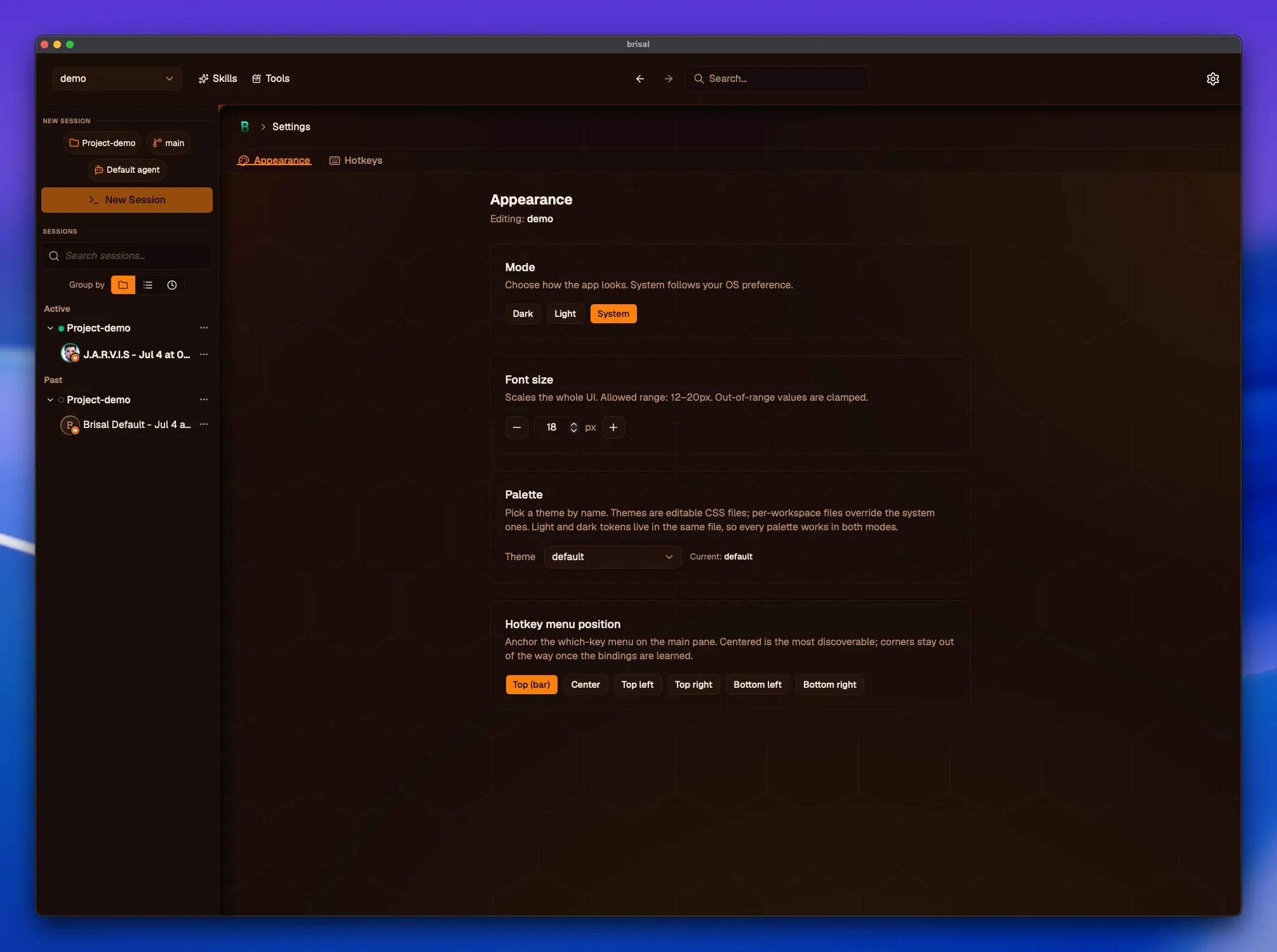
The Appearance tab: the three axes — mode, font size, palette — plus the hotkey menu position, scoped to the workspace named in “Editing:”. Copy from workspace… sits below.
The three axes
Mode
Mode decides light vs. dark:
- Dark / Light — pin the app to that mode.
- System — follow your OS light/dark preference and change with it. This is the default.
Every palette defines both a light and a dark variant (see Palettes are data), so switching mode never leaves you without colors — the same palette simply re-renders in the other variant.
Font size
Font size is a single value that scales the entire UI, not just body text. It defaults to 14px and is bounded to a safe range (12–20px); values outside that range are clamped rather than rejected, so you can’t shrink the app into illegibility or blow it up past the window. The stepper and the number field both commit within those bounds.
Palette
The palette is the color identity you pick by name — default (Brisal’s
orange flame theme) out of the box, plus any palette you’ve added to the
workspace. This is the axis that makes theming open-ended, and it’s the rest of
this page.
Hotkey menu position
The Appearance screen carries one more per-workspace control that isn’t a theming
axis: Hotkey menu position, which decides where the
keymap’s which-key menu appears when you
start a leader sequence. The choices are Center (the default), Top, and
the four corners (Top-left, Top-right, Bottom-left, Bottom-right).
Top is a full-width strip below the session header; the rest float as a small
card. Like the axes above, it’s per-workspace and inherits a system default when
left unset.
Palettes are data
The key idea: a palette is just a file. Brisal doesn’t ship a fixed menu of
themes with a color picker bolted on — instead it reads palettes from a folder
on disk. Drop a valid CSS file into a workspace’s themes/ folder and it shows up
in the palette picker by its filename. Delete it and it’s gone. The picker is a
view of a directory, not a hard-coded list.
Concretely, a palette is a theme file: a small CSS file that contains nothing but color tokens, in two blocks —
/* themes/midnight.css — a palette named "midnight" */
:root {
  --background: #f7f8fb;
  --foreground: #10131a;
  --primary: #3b5bdb;
  --primary-foreground: #ffffff;
  --border: #dfe3ec;
  /* …the rest of the tokens… */
}

.dark {
  --background: #0b0d12;
  --foreground: #e8ebf2;
  --primary: #748ffc;
  --primary-foreground: #0b0d12;
  --border: #232838;
  /* …the same tokens, retuned for dark… */
}- The
:rootblock carries the palette’s light colors. - The
.darkblock carries the dark colors.
Both live in one file, which is why every palette works in both modes: mode and
palette are orthogonal, and a single theme file answers “what color is this?” for
whichever mode is active. The filename (minus .css) becomes the palette’s name in
the picker.
Adding a palette
There’s no “new theme” button — like a skill, you author a palette in place by putting a file where Brisal looks:
- Create the file in the workspace’s
themes/folder. Name it for the palette you want —themes/midnight.cssgives you a palette calledmidnight. Names must be lowercase letters, digits, and single hyphens, with a.cssextension (Midnight Blue.csswon’t be picked up;midnight-blue.csswill). - Fill in the tokens. Copy the two-block skeleton above and retune the values. The complete list of tokens a palette can set is in Config files.
- Pick it. Open Settings → Appearance, and the new name is in the palette picker. Selecting it re-themes the workspace immediately.
The picker lists the palettes in that workspace’s themes/ folder, alongside the
built-in default. A palette you add is available in the workspace you added it
to — appearance, palettes included, is per-workspace.
When something’s off, Brisal falls back — it doesn’t break
Appearance is forgiving by design:
- Unknown or deleted palette — if a workspace names a palette that no longer
resolves (you deleted the file, or renamed it), Brisal falls back to the
defaultpalette and tells you with a toast, rather than rendering colorless. - Out-of-range font size — a value below 12 or above 20 (say, from a hand-edited config file) is clamped into range, again with a toast.
- A malformed theme file — a file that produced no valid token blocks is skipped, and the default is used.
You never end up staring at an unstyled or broken app because of a bad appearance setting.
Copying appearance between workspaces
Because appearance is per-workspace, getting a second workspace to match a first would mean re-doing every setting. Copy from workspace… does it in one step: on the Appearance screen, pick a source workspace and click Copy. Brisal replaces the current workspace’s mode, font size, palette, and hotkey menu position with the source’s — and copies the source’s theme files along, so a copied palette name always resolves in its new home. (The option only appears when there’s another workspace to copy from. Copying keybindings is a separate action on the Hotkeys tab.)
Built-in palettes
Brisal ships one built-in palette: default — the orange flame theme, in both
its light and dark variants. It’s always present in the picker, so every workspace
has a sensible starting point out of the box.
Beyond that, palettes are yours to add. More built-in palettes are on the roadmap; until they land, any theme past the default is one you (or a workspace you copied from) authored.
What to read next
- Settings — how to reach settings, and the global-vs-workspace scope model that appearance is one instance of.
- Workspaces — the unit appearance is scoped to, and why compartmentalizing your work this way is the point.
- Config files — the
config.tomlfields and the complete palette token reference for authoring a theme file.